
Clarity
Show the agent’s reasoning
What it means
Why this matters
Related patterns

Clear prioritization logic
The system openly communicates that severity and impact guide prioritization. This gives users clarity on how decisions are made, no hidden logic.
Labeled severity & scope
Each incident includes tags like "High" or "Medium" severity, and explicit impact stats (e.g., “233 Devices”). This provides transparent justification for prioritization choices.
Embedded justification in descriptions
Each incident explanation includes why it matters (e.g., “single point of failure,” or “client deliverables are delayed”). This prevents second-guessing and builds trust in automated triage.
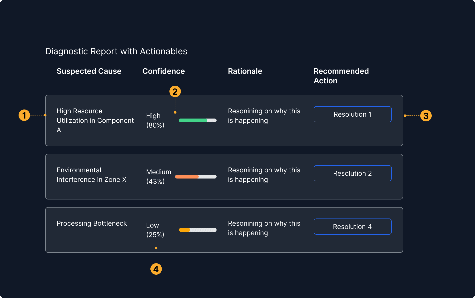
Reasoning linked to confidence
Explanations are paired with certainty indicators, showing why the system believes something and how strongly it believes it. This helps users validate or challenge the logic.
Confidence levels made visible
Each system insight or recommendation is accompanied by a clear degree of certainty, often represented with a percentage or visual indicator. This helps users assess how much trust to place in each suggestion.
Actions calibrated to certainty
The system tailors its suggested actions based on its confidence level more assertive steps when certainty is high, and more exploratory or cautious ones when confidence is low.
Low confidence is still shown
Even uncertain insights are surfaced, not hidden — but clearly marked. This promotes transparency and allows human judgment to guide next steps, especially when automated logic is unsure.

Source labels are visually distinct and clickable
The source elements are styled for immediate recognition and likely interactive (e.g., tags, badges, or buttons), improving usability and clarity.
Claims supported by cited references
Each recommendation is backed by named sources, allowing users to verify the rationale and explore more details independently.
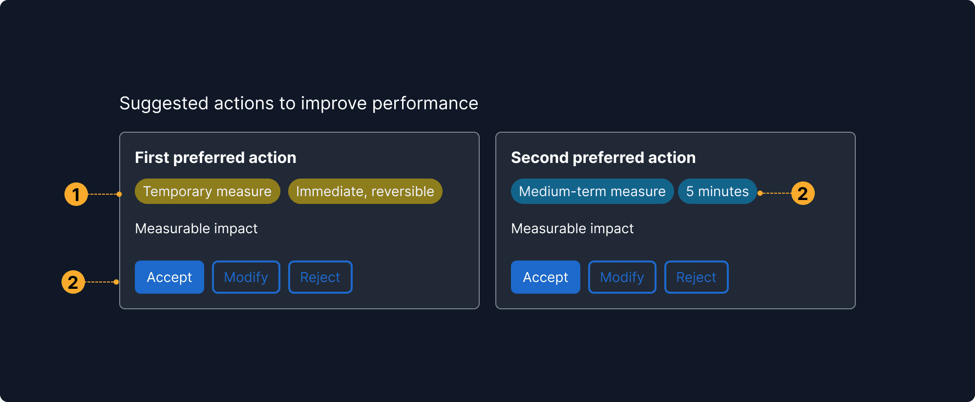
Consequences and benefits are explicit
Includes options with a clear summary of what it changes and what the effect will be, allowing the user to compare outcomes at a glance.
Multiple actions presented side-by-side
The interface surfaces more than one possible action instead of a single automated path. This supports user agency and accommodates different risk tolerances or priorities.
Supports informed trade-off decisions
By presenting pros and cons transparently, the system helps users make context-aware decisions, especially when no option is perfect.
Labels indicate duration and reversibility
Visual tags communicate whether an option is temporary, reversible, or long-term. This helps users understand not just the effect, but also the scope and risk.